Data visualizations are key tools for marketers. They turn complex data into clear insights.
In the fast-paced world of marketing, understanding trends and patterns quickly is vital. Data visualizations help marketers see the big picture without getting lost in numbers. These visual tools can show how campaigns perform, highlight customer behaviors, and reveal market opportunities.
With the right data visualizations, marketers can make smarter decisions, communicate more effectively, and achieve better results. This blog will explore the different types of data visualizations that are essential for marketers. By understanding and using these tools, you can enhance your marketing strategies and drive success. Let’s dive in and discover how data visualizations can transform your marketing efforts.

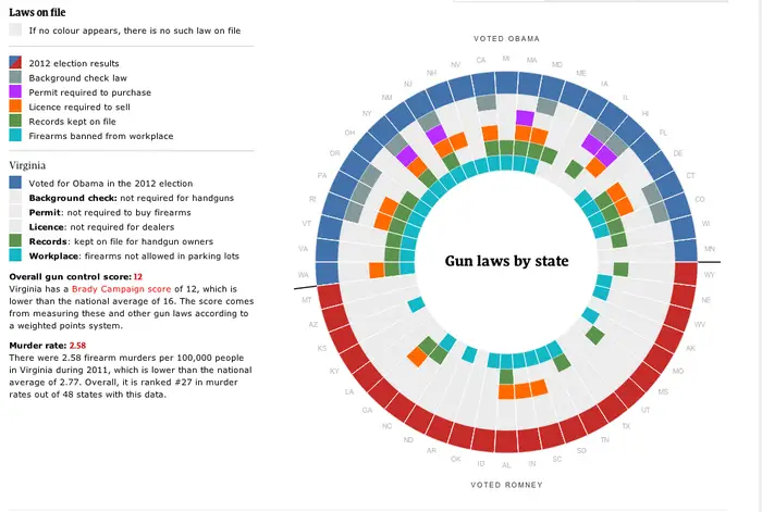
Credit: supermetrics.com
Importance Of Data Visualization
Data visualization is crucial for marketers. It helps in turning complex data into simple visuals. These visuals make it easier to understand the information. They provide clear insights at a glance. Marketers can use these insights to make informed decisions.
Without visuals, data can be overwhelming. Large spreadsheets and numbers can confuse and slow down the process. Visuals simplify data and highlight important points. This is why data visualization is important for marketers.
Enhancing Decision Making
Data visualization enhances decision making. It presents data in a clear and concise manner. This allows marketers to quickly grasp the key points. They can identify which strategies are working and which are not.
Making decisions based on visuals is faster. It reduces the risk of misinterpretation. Marketers can see the bigger picture and make better choices. This leads to more effective marketing campaigns and better results.
Identifying Trends
Identifying trends is easier with data visualization. Trends show changes and patterns over time. Visuals like graphs and charts highlight these trends clearly.
Marketers can spot upward or downward trends quickly. They can adjust their strategies based on these trends. This helps in staying ahead in the competitive market. Understanding trends is key to successful marketing.

Credit: supermetrics.com
Types Of Data Visualizations
Understanding the types of data visualizations is crucial for marketers. Data visualization helps in presenting complex data in an easy-to-understand format. This section focuses on different types of data visualizations that marketers can use to make informed decisions and communicate effectively.
Charts And Graphs
Charts and graphs are the most common types of data visualizations. They help in depicting trends, comparisons, and patterns in data. Here are some popular types:
- Bar Charts: Useful for comparing different groups.
- Line Graphs: Ideal for showing trends over time.
- Pie Charts: Effective for showing proportions and percentages.
- Scatter Plots: Great for identifying relationships between variables.
These visualizations make it easy to spot significant data points. They provide a clear picture of the data landscape.
Infographics
Infographics combine text, images, and data visualizations to tell a story. They are highly engaging and easy to share. Infographics can simplify complex data, making it accessible to a wider audience. Some key elements include:
- Icons and Illustrations: These help in breaking down information.
- Color Schemes: Consistent colors make the data easy to follow.
- Data Points: Highlight critical statistics and numbers.
- Text: Brief and informative text to explain the visuals.
Infographics are perfect for social media, blog posts, and presentations. They make data memorable and impactful.
Tools For Creating Visualizations
Data visualization helps marketers understand complex data. The right tools can transform raw data into clear, actionable insights. Below, we’ll explore some popular software options and tips on choosing the right tool for your needs.
Popular Software Options
There are many tools available for creating data visualizations. Here are some popular options:
- Tableau: Known for its flexibility and user-friendly interface. Ideal for interactive dashboards.
- Microsoft Power BI: Integrates well with Microsoft products. Great for detailed reports.
- Google Data Studio: Free and integrates with Google Analytics. Perfect for web data.
- QlikView: Offers powerful data discovery features. Good for business intelligence.
- Infogram: Easy to use. Best for infographics and simple charts.
Choosing The Right Tool
Picking the right tool depends on your specific needs. Consider these factors:
- Budget: Some tools are free, while others require a subscription.
- Integration: Ensure the tool integrates with your existing software.
- Ease of Use: Choose a tool that matches your team’s skill level.
- Data Volume: Some tools handle large data sets better than others.
- Customization: Consider how much you need to customize your visualizations.
Here’s a quick comparison table to help you decide:
| Tool | Cost | Integration | Ease of Use | Data Volume | Customization |
|---|---|---|---|---|---|
| Tableau | Paid | High | Moderate | High | High |
| Microsoft Power BI | Paid | High | Moderate | High | Moderate |
| Google Data Studio | Free | High | Easy | Moderate | Low |
| QlikView | Paid | High | Moderate | High | High |
| Infogram | Paid | Moderate | Easy | Low | Moderate |

Credit: www.smartboost.com
Visualizing Marketing Data
Data visualization helps marketers understand their data better. It turns raw data into visual stories. This makes it easier to spot patterns and insights. Let’s explore some key areas of marketing data visualization.
Customer Demographics
Knowing your customer demographics is crucial. It helps you tailor your marketing strategies. Use charts and graphs to visualize this data. Here are some common ways:
- Pie charts: Show the age distribution of your customers.
- Bar graphs: Compare customer numbers across different regions.
- Heat maps: Display customer density in various locations.
These tools help you understand who your customers are. You can then create targeted campaigns. For example, if most of your customers are young adults, use social media ads. If they are older, email marketing might work better.
Campaign Performance
Measuring campaign performance is essential. It tells you what works and what does not. Use visual tools to track these metrics. Here are some effective methods:
- Line graphs: Monitor campaign engagement over time.
- Conversion funnels: Track the customer journey from interest to purchase.
- Scatter plots: Analyze the relationship between different campaign variables.
These visualizations help you see the bigger picture. You can quickly identify successful campaigns. Then, optimize your strategies for better results. For instance, if a campaign has low engagement, tweak your content or targeting. If it has high conversion rates, invest more in similar strategies.
Best Practices For Effective Visualizations
Data visualizations are vital for marketers. They help present complex information clearly. Adopting the best practices ensures your visualizations are effective and engaging. Below are some of the best practices for creating powerful data visualizations.
Simplifying Complex Data
Start by identifying the key message. Focus on the most important data points. Too much information can overwhelm the viewer. Use charts and graphs that match your data type. Bar graphs work well for comparisons. Line graphs are great for trends over time.
Avoid clutter. Remove unnecessary elements from your visualizations. Labels, gridlines, and legends should be minimal. This keeps the viewer’s attention on the data.
Using Color Effectively
Colors can highlight important information. Use contrasting colors to make key points stand out. Limit your color palette to keep it simple. Too many colors can confuse the viewer.
Consider colorblind viewers. Use patterns or textures in addition to colors. This ensures everyone can understand your visualizations.
Maintain consistency in your color choices. Use the same colors for the same data types across different charts. This helps the viewer easily interpret the information.
Common Mistakes To Avoid
Creating data visualizations is a valuable skill for marketers. But, it is easy to make mistakes that can lead to confusion and misinterpretation. Let’s explore the common pitfalls and learn how to avoid them.
Overloading With Information
One frequent mistake is providing too much data in a single visualization. This overwhelms your audience and makes it hard to understand the key message.
- Keep it simple: Focus on one main point per chart.
- Use clear labels: Ensure all elements are easily readable.
- Avoid clutter: Remove unnecessary details that distract from the main data.
Consider using multiple charts if you have a lot of information to share. This helps in breaking down complex data into manageable chunks.
Misleading Visuals
Misleading visuals can distort the message. This happens when charts are not designed correctly, or data is manipulated.
Examples of misleading visuals:
| Type of Misleading Visual | Description |
|---|---|
| Inconsistent scales | Using different scales to exaggerate or minimize differences. |
| Truncated axis | Starting the y-axis at a value other than zero. |
To avoid this, always use consistent scales and start your axes at zero. This ensures your data is represented accurately and your audience can trust your visuals.
Case Studies
Data visualizations can transform how marketers analyze and present their data. By using visual elements, marketers can better understand trends, patterns, and insights. In this section, we will explore case studies that highlight the impact of data visualizations in successful marketing campaigns. These real-world examples show how visual data can drive decision-making and improve outcomes.
Successful Campaigns
One e-commerce company used data visualizations to track customer behavior. They created heat maps to see where users clicked most on their website. This helped them optimize their site layout. As a result, they increased conversions by 20% within three months.
Another example comes from a social media firm. They used pie charts to analyze user engagement across different platforms. This visual data showed that Instagram had the highest engagement rates. The firm shifted its focus to Instagram and saw a 30% increase in overall engagement.
Lessons Learned
These case studies offer valuable lessons. First, visual data makes patterns easier to spot. Marketers can quickly see what works and what doesn’t. This saves time and resources.
Second, data visualizations help in making better decisions. When marketers see clear data, they can make informed choices. This leads to more effective campaigns.
Finally, using visual data can enhance communication within teams. Everyone understands the data better. This improves collaboration and strategy development.
Future Trends In Data Visualization
The future of data visualization is evolving rapidly. Marketers must stay updated with the latest trends to keep up. Emerging technologies offer new ways to understand and present data. Two key trends are AI and machine learning, and interactive dashboards.
Ai And Machine Learning
Artificial intelligence (AI) and machine learning (ML) are transforming data visualization. These technologies can analyze large datasets quickly. They identify patterns and trends that humans might miss. This leads to more accurate predictions and insights.
AI-driven tools help marketers create personalized visualizations. These tools use customer data to tailor content. This makes marketing efforts more effective. For example, AI can segment audiences based on behavior. Then, it creates visual reports for each segment. This helps marketers understand their audience better.
Machine learning algorithms also improve over time. They learn from new data and adjust their models. This means visualizations become more accurate and relevant. Marketers can make better decisions based on this information.
Interactive Dashboards
Interactive dashboards are another important trend. These dashboards allow users to explore data in real-time. They provide a dynamic way to view and manipulate data. Users can filter, drill down, and customize the view.
Interactive dashboards make data more accessible. Marketers can see the information they need at a glance. They can also share insights with their team easily. These dashboards often come with features like drag-and-drop, real-time updates, and customizable widgets.
An example of an interactive dashboard feature is real-time data updates. This ensures that the information is always current. Marketers can make quick decisions based on the latest data. Another feature is drill-down capabilities. Users can click on a data point to see more detailed information.
Interactive dashboards also support collaboration. Team members can share insights and work together. This makes it easier to align marketing strategies and goals.
Frequently Asked Questions
What Are The Benefits Of Data Visualization For Marketers?
Data visualization helps marketers understand complex data quickly. It aids in identifying trends, patterns, and insights. This makes decision-making more effective.
How Can Data Visualization Improve Marketing Strategies?
Data visualization provides clear insights into customer behavior. It allows marketers to refine strategies based on visual data interpretations. This leads to better-targeted campaigns.
Which Tools Are Best For Marketing Data Visualization?
Popular tools include Tableau, Google Data Studio, and Power BI. They offer user-friendly interfaces and advanced features. These tools help create impactful visualizations.
How Do Visualizations Enhance Data Storytelling For Marketers?
Visualizations make data storytelling more engaging and understandable. They help convey messages clearly and effectively. This results in a stronger impact on the audience.
Conclusion
Data visualizations are vital for marketers. They simplify complex data. This clarity aids decision-making. Visual tools make trends obvious. They highlight key insights quickly. Marketers can adapt strategies with confidence. Effective visuals boost communication. They engage audiences better. Use these tools to stay competitive.
Keep your data clear and compelling.

I am a passionate digital marketer with a strong expertise in SEO and article writing. With years of experience in crafting compelling content and optimizing it for search engines, I help businesses enhance their online visibility and drive organic traffic. Whether it’s creating engaging blog posts or implementing effective SEO strategies, I am dedicated to delivering results that make an impact.
