Contact forms play a vital role in capturing leads. They are the bridge between your audience and your business.
Do you often find people visiting your site but not filling out your contact form? You might wonder, what can you do to boost those numbers? Increasing contact form conversions is not just about adding more fields or making your form flashy.
It’s about understanding user behavior and making the experience seamless. An effective contact form can turn a casual visitor into a potential customer. In this blog, we will explore practical strategies to enhance your contact form conversions, ensuring you don’t miss out on valuable leads. Let’s dive into the essentials that can make a big difference.
Optimizing Form Design
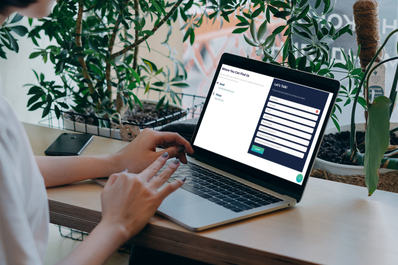
Optimizing the design of your contact form is crucial for increasing conversions. A well-designed form can be the difference between a completed submission and a potential customer leaving your site. Let’s explore some key aspects of form design that can help improve your conversion rates.
Simplify Fields
One of the most important steps in optimizing your form design is to simplify the fields. Users are more likely to complete a form if it only asks for essential information. Avoid asking for unnecessary details. This not only reduces the time required to fill out the form but also minimizes the chances of errors.
Consider the following tips to simplify your form fields:
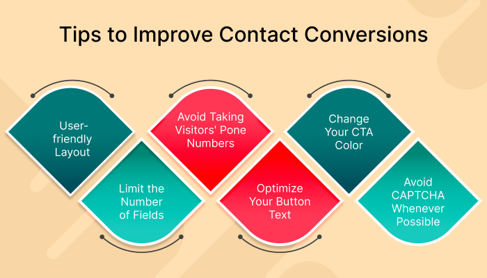
- Limit the number of fields to the absolute minimum.
- Combine fields where possible, such as “First Name” and “Last Name” into “Full Name.”
- Use dropdowns or checkboxes for easy selections instead of open text fields.
Use Clear Labels
Clear and concise labels are essential for guiding users through your form. Labels should be straightforward and unambiguous, making it easy for users to understand what information is required.
Here are some best practices for using clear labels:
- Place labels close to their corresponding fields for better visibility.
- Use simple language that is easy to understand.
- Avoid technical jargon or complex words.
By focusing on these elements, you can create a form that is user-friendly and encourages more submissions. Remember, the goal is to make the process as easy and quick as possible for your users.

Credit: www.interodigital.com
Enhancing User Experience
Enhancing the user experience is crucial for increasing contact form conversions. A smooth and pleasant experience encourages more users to complete the form. Below, we explore two key elements that can significantly improve user experience: mobile-friendly forms and fast load times.
Mobile-friendly Forms
Many users access websites through their mobile devices. Ensuring your contact forms are mobile-friendly is essential. Here are some tips to make your forms mobile-friendly:
- Responsive Design: Ensure forms adjust to various screen sizes.
- Large Input Fields: Make fields easy to tap and fill out.
- Simple Layout: Avoid clutter and keep the form straightforward.
Consider using a one-column layout for easier navigation on mobile devices. A clutter-free design with large, easy-to-tap buttons enhances usability. This leads to higher conversions.
Fast Load Times
Fast load times are vital for retaining users. Slow-loading forms can frustrate users and increase abandonment rates. Here are some strategies to ensure fast load times:
- Optimize Images: Use compressed images to reduce load time.
- Minimize Code: Remove unnecessary code and scripts.
- Use Caching: Implement browser caching for faster repeat visits.
Prioritize reducing the size of your web pages. This ensures quicker load times. Users are more likely to complete forms if they load quickly.
Incentives And Offers
Incentives and offers can be powerful tools to increase contact form conversions. By providing potential customers with value, you can encourage them to share their details. Let’s explore some effective strategies under the subheadings Provide Value and Exclusive Discounts.
Provide Value
People are more likely to fill out a contact form if they see the value. Offer something beneficial in return.
- Free E-books: Share informative guides or e-books.
- Webinars: Host free webinars on relevant topics.
- Templates: Provide useful templates for their work.
These incentives can make your form more appealing. Visitors get something valuable and you get their contact information.
Exclusive Discounts
Everyone loves a good deal. Offering exclusive discounts can be a great motivator.
| Type of Discount | Benefit |
|---|---|
| First-time Buyer Discount | Encourages new customers to make a purchase. |
| Seasonal Offers | Boosts sales during specific times of the year. |
| Referral Discounts | Increases customer base through referrals. |
These discounts create a sense of urgency. Customers are more likely to act quickly.

Credit: www.travelpayouts.com
Effective Call-to-actions
Effective call-to-actions (CTAs) are crucial for increasing contact form conversions. They guide users towards taking the desired action. By using clear, compelling language and strategically placing CTAs, you can significantly boost your conversion rates. Let’s explore some actionable tips to create effective CTAs under the following subheadings.
Action-oriented Text
Words matter. Use action-oriented text to prompt users to act. Instead of “Submit,” try “Get Your Free Quote.” This creates urgency and clarity. Keep your text concise. Aim for 2-4 words. Use verbs that inspire action. Words like “Download,” “Get,” “Join,” or “Start” can be very effective.
Avoid jargon. Use simple language that everyone understands. This ensures your message is clear. Test different variations to see what works best. Small changes can have a big impact.
Strategic Placement
Placement matters. Your CTA should be easy to find. Place it above the fold. Users should see it without scrolling. This increases visibility. If your form is long, use multiple CTAs. One at the top and one at the bottom works well.
Consider using directional cues. Arrows or images can draw attention to your CTA. Make sure your CTA stands out. Use contrasting colors. This makes it more noticeable.
Test different placements. See what works best for your audience. Analytics can provide valuable insights. Use this data to optimize your CTAs. Remember, the goal is to make it as easy as possible for users to convert.
Building Trust
Building trust is crucial for increasing contact form conversions. Visitors need to feel secure and confident before sharing their personal information. This section will cover key elements to build trust: Privacy Assurance and Social Proof.
Privacy Assurance
People worry about their data. To address this, provide clear privacy policies near your contact form. A simple sentence like, “We respect your privacy. Your information stays confidential,” can go a long way.
Consider adding a link to your full privacy policy. This shows transparency. Also, use secure HTTPS protocol. The lock icon in the browser reassures visitors. They know their data is safe.
Here’s a sample privacy assurance statement:
We value your privacy. Your data is safe and will not be shared.
Social Proof
Social proof helps build trust. Include testimonials from satisfied users. A quote from a happy customer can boost confidence.
Showcase trust badges or certifications if you have them. These badges act as endorsements. They tell visitors your site is reliable.
Here’s an example of a testimonial:
"This service is fantastic! I felt confident sharing my details." - Jane D.
Also, display reviews and ratings if possible. Positive reviews act as powerful social proof. They can significantly increase conversions.
A/b Testing
A/B Testing is a powerful method to improve contact form conversions. It involves creating two or more variations of a form. Then, you test these versions with real users. The goal is to find out which form performs better.
Test Form Variations
Start by creating different versions of your contact form. Change one element at a time. This could be the form’s layout, button color, or field labels. Make sure each version is unique but similar enough to provide a fair comparison.
Use a tool that splits the traffic evenly between the versions. This ensures each form gets tested under the same conditions. Keep the test running long enough to gather meaningful data.
Analyze Results
After collecting data, compare the performance of each form. Look at metrics like submission rate, time to complete, and user feedback. Identify which version has the highest conversion rate.
Note any trends or patterns in the results. These insights help you understand what changes lead to better conversions. Use this information to refine your forms further.
Remember, A/B Testing is an ongoing process. Continuously test new variations to keep improving your contact form conversions.
Tracking And Analytics
Tracking and analytics are essential for increasing contact form conversions. You must understand how users interact with your forms. This helps to pinpoint issues and optimize the user experience. By tracking data, you can make informed decisions. Analytics tools provide insights into user behavior, conversion rates, and more.
Monitor Performance
First, monitor your form’s performance regularly. Use tools like Google Analytics. Track metrics such as form completion rates and drop-off points. This data shows where users abandon the form. It also highlights which fields cause confusion.
Identify patterns in user behavior. For example, see if certain form fields take longer to complete. This could indicate complexity or lack of clarity. Make adjustments based on these insights to improve the user experience.
Adjust Strategies
Adjust your strategies based on your findings. Simplify fields that users struggle with. Remove unnecessary fields to reduce friction. Test different form layouts and designs. Use A/B testing to compare results.
Consider the use of progressive forms. These forms display only essential fields at first. Additional fields appear as users complete initial sections. This approach can increase completion rates. Always keep the user experience in mind.
Remember, continuous optimization is key. Regularly review your analytics data. Make necessary adjustments to ensure your forms perform well. Tracking and analytics help you stay informed and proactive.
Follow-up Strategies
Follow-up strategies are crucial for boosting contact form conversions. Responding promptly and effectively can transform leads into customers. Effective follow-up strategies help build trust and keep potential clients engaged. Let’s explore two essential follow-up strategies.
Automated Responses
Automated responses ensure immediate acknowledgment of a contact form submission. This quick response reassures the user their message was received. Use a friendly tone in your automated message. Thank the user for reaching out and provide an estimated response time. Include any relevant information that can help the user in the meantime.
Automated responses save time and set the stage for further communication. They keep the user engaged while waiting for a personalized response. Ensure your automated message is clear and concise.
Personalized Communication
Personalized communication helps build a stronger connection with potential customers. Address the user by name and reference their specific inquiry. This shows you value their interest and are dedicated to helping them.
Respond to the user’s questions or concerns in detail. Offer additional information or resources that may be helpful. Personalized communication demonstrates your commitment to providing excellent customer service. It fosters trust and encourages users to move forward with your business.

Credit: forms.io
Frequently Asked Questions
How Can I Increase Contact Form Submissions?
To increase contact form submissions, simplify the form fields, make the CTA button prominent, and offer clear value. Ensure the form is mobile-friendly. Test different form designs and placements to see what works best.
What Makes A Good Contact Form?
A good contact form is short, clear, and easy to use. Limit the number of fields to essential information. Ensure it is mobile-responsive and has a strong call-to-action.
Why Is My Contact Form Not Converting?
Your contact form may not be converting due to too many fields, poor design, or lack of trust signals. Simplify the form, improve its design, and add trust elements like privacy policies.
How Do I Design A User-friendly Contact Form?
Design a user-friendly contact form by keeping it simple, using clear labels, and ensuring mobile compatibility. Highlight the submit button and provide instructions if needed.
Conclusion
Boosting contact form conversions is simpler than you might think. Focus on user experience. Simplify the form fields. Make your call-to-action clear and compelling. Test different designs and messages. Analyze the results. Improve based on feedback. With these steps, you can see better engagement.
Happy users mean more conversions. Start refining your forms today. Success is within reach.

I am a passionate digital marketer with a strong expertise in SEO and article writing. With years of experience in crafting compelling content and optimizing it for search engines, I help businesses enhance their online visibility and drive organic traffic. Whether it’s creating engaging blog posts or implementing effective SEO strategies, I am dedicated to delivering results that make an impact.
